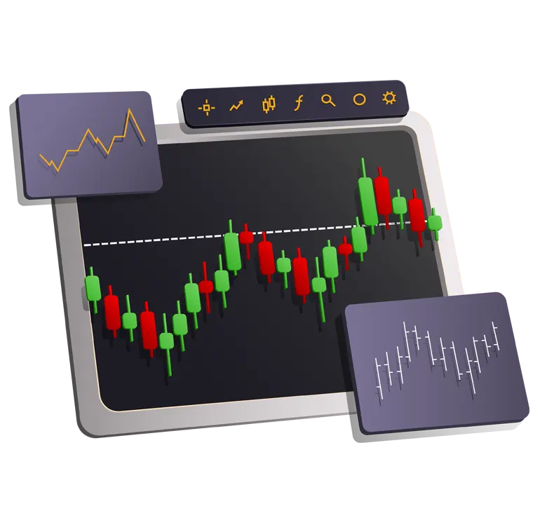
В тази статия ще научиш кои са най-използваните Форекс графики, и каква информация дават.
Ще видиш плюсовете и минусите на различните Форекс графики и ще можеш да избереш графиката, която най-добре пасва на твоята търговия.
Нека започваме.
Съдържание
Въведение
Тикова графика
Линейна графика
Барова графика
Свещна Форекс графика / Японски свещи
Графика Heikin-Ashi
Renko графика
Обобщение
Въведение
Графиката представлява визуално представяне на движението на цената, на даден инструмент, за определен период от време. Платформите за търговия предлагат различни видове Форекс графики.
Важно е да се отбележи, че освен по вид, графиките се делят и по време. В зависимост от това, за какъв период се формират свещите, баровете или от каквито елементи са изградени графиките.
Надолу в статията ще разбереш, какво имам предвид.
Всяка графика може да се разглежда на различен времеви период.
Най-разпространените периоди са:
- М1;
- М5;
- М15;
- М30;
- Н1;
- Н4;
- D1;
- W;
- MN.
Някои платформи за търговия разполагат със секундни периоди, три минутни, шест часови, дванайсет часови и др. За да разбереш, какво общо има периода с графиката, ще използвам пример с барова графика.
Ако вземем H1 (едночасов период), това означава, че един бар се формира за един астрономически час. Респективно D1 означава, че един бар се формира за един ден - 24 часа.
От тук следва, че в един еднодневен бар се съдържат 24 едночасови бара. В един едночасов бар - четири петнайсет минутни, два трийсет минутни, шейсет едноминутни и т.н.
Това правило не се отнася за всички видове графики!
Някои Форекс графики не се формират по време, а по брой изтъргувани контракти или сключени сделки. Други използват математически алгоритми, за да игнорират влиянието на времето.
След като имаш вече основата, можем да започваме с конкретните Форекс графики - какво представляват, как се формират и каква информация дават.
Тикова форекс графика
Тиковата форекс графика чертае нов период ( свещ, бар, и т.н. ), всеки път, когато определено количество сделки бива изтъргувано.
За разлика от времевите форекс графики, където нов период се чертае за определено време, както вече обясних във въведението.
Много начинаещи трейдъри мислят, че това е минутна графика, но всъщност не е така.
*Тикова графика от платформата за търговия MetaTrader
Тиковата графика много прилича на обемната ( Volume chart ) и за да стане по-ясно, ще сравня двете графики.
При 1000 тикова графика, периода се формира на всеки 1000 сделки, независимо колко контракта са изтъргувани.
Докато при обемната форекс графика, всеки период се формира на база определен брой контракти, независимо с колко сделки са изтъргувани тези контракти.
Пример:
- 10 000 обемна графика, формира един период, когато бъдат изтъргувани 10 000 контракта. Това може да стане с една или няколко сделки;
- 10 000 тикова графика, формира един период, когато бъдат изтъргувани 10 000 сделки. В тези 10 000 сделки, могат да бъдат изтъргувани 1000 или 100 000 контракта.
Контракта представлява броя валутни единици, с които се търгува. На Форекс пазара един стандартен контракт е 100 000 единици от базовата валута.
Термина е по-известен като Lot.
Научи повече за лотовете в статията:
>> Управление на капитала на Форекс: Подробен наръчник
Трябва да се знае, че графиката визуализира изтъргувания обем в конкретния брокер, банка и т.н. Форекс брокер не може да покаже целия изтъргуван обем на валутния пазар. Той показва само сделките, които са изтъргувани от неговите клиент.
Линейна форекс графика
Линейната графика е най-елементарния начин за визуално представяне на движението на цената. Представлява линия, която свързва цената на затваряне със следващата цена на затваряне.
Някои платформи дават възможност за изчисление на база цена на отваряне, най-висока или най-ниска цена. Това става чрез промяна на формулата за изчисление.
Линейната форекс графика показва общото движение на цената за определен период от време. Това е най-елементарната графика и не дава много информация.
Така изглежда линейна форекс графика в платформата MetaTrader.
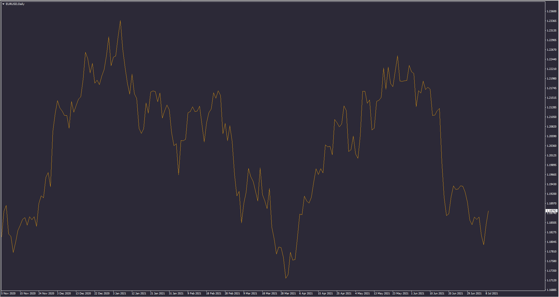
*Линейна, дневна графика на EURUSD | MetaTrader
Следващите графики, които ще ти покажа, дават повече информация на трейдърите и са по-интересни.
Повече за търговския терминал MetaTrader, можеш да прочетеш в подробното ни ръководство за стартиране на търговия!
Форекс търговия: Пълно ръководство за начинаещи
Подробен наръчник, за това как да стартираш Форекс търговия. Ако искаш да изградиш солидна основа, съветите и стъпките в това ръководство ще ти бъдат много полезни.
Барова графика
Баровата форекс графика е малко по-сложна и дава повече информация.
Тя показва цените на отваряне и затваряне на всеки период, а също така и най-високите и най-ниските стойности за периода.
Open | High | Low | Close
Така изглежда барова форекс графика в платформата MetaTrader.
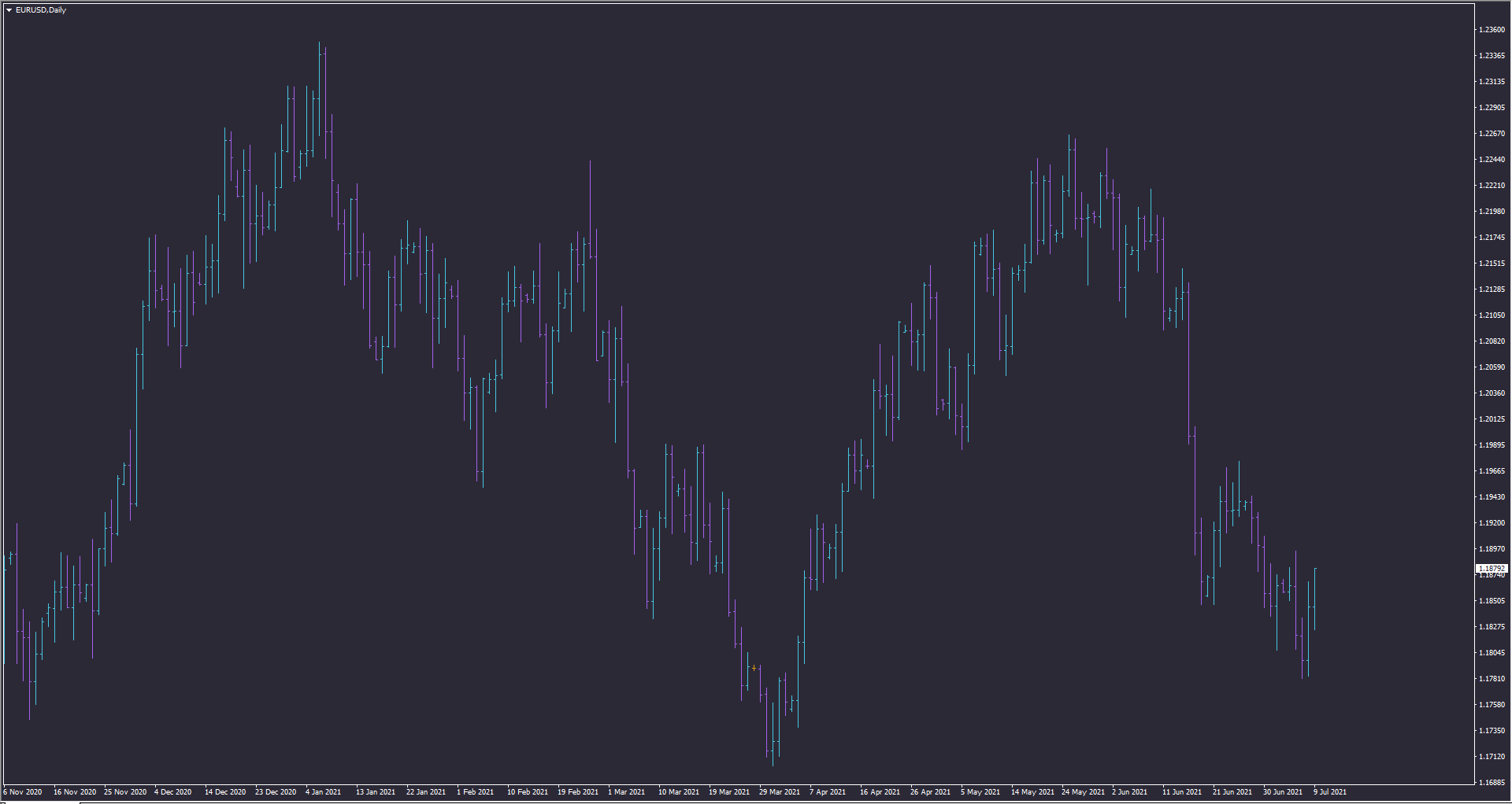
*Барова, дневна графика на EURUSD | MetaTrader
Графиката е изградена от звена наречени барове.
Всеки бар показва четири стойности, цена на отваряне, най-висока, най-ниска и цена на затваряне. На Форекс пазара рядко се случва, но при други пазари и активи, може четирите цени да си съвпадат. Това означава, че цената не се е движила за съответния период от време.
Освен това всеки бар отговаря на точно определен период от време, например 1 минута, 1 час, 1 ден или 1 месец. Това означава, че бара се формира за толкова време.
Ако говорим за едночасов бар, това значи, че от отваряне до затваряне на бара изминава точно един час. Всеки едночасов бар, съдържа в себе си шейсет едноминутни бара, четири петнайсет минутни бара и т.н. Всеки еднодневен бар съдържа 24 едночасови бара и 6 четиричасови бара.
Същата е логиката при всички периоди.
На изображението по-долу виждаш пример за възходящ и низходящ бар.
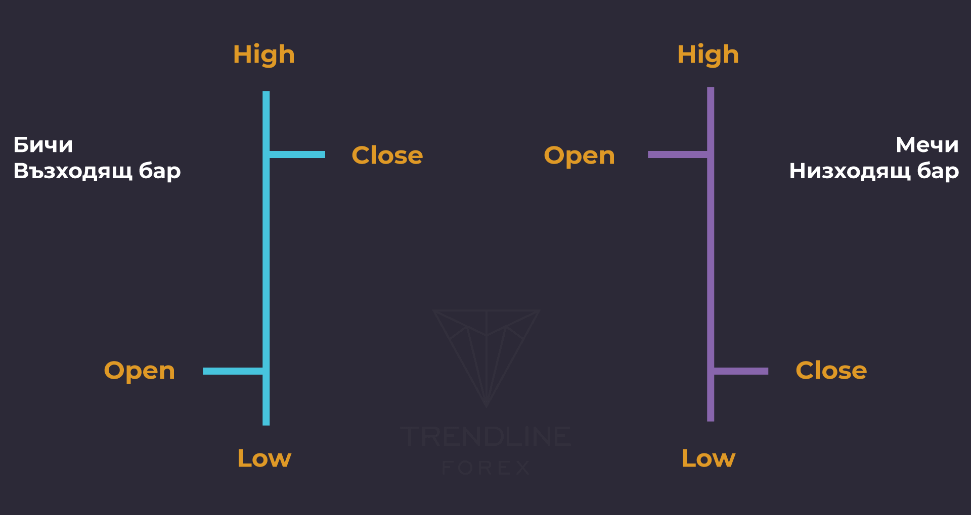
- HIGH: върхът на вертикалата отбелязва най-високата цена за периода;
- LOW: дъното на вертикалната линия отбелязва най-ниската цена за периода;
- OPEN: хоризонталната линия в ляво показва цената на отваряне;
- CLOSE: хоризонталната линия в дясно, показва цената на затваряне.
Най-лесно ще ги запомниш, като знаеш че:
- Ако дясната линия е по-високо от лявата, значи барът е възходящ;
- Ако дясната линия е по-ниско от лявата, значи барът е низходящ.
Свещна Форекс графика / Японски свещи
Свещната графика дава същата информация, като баровата графика, но се възприема по-добре визуално.
Позната още, като форекс графика тип Японски свещи.
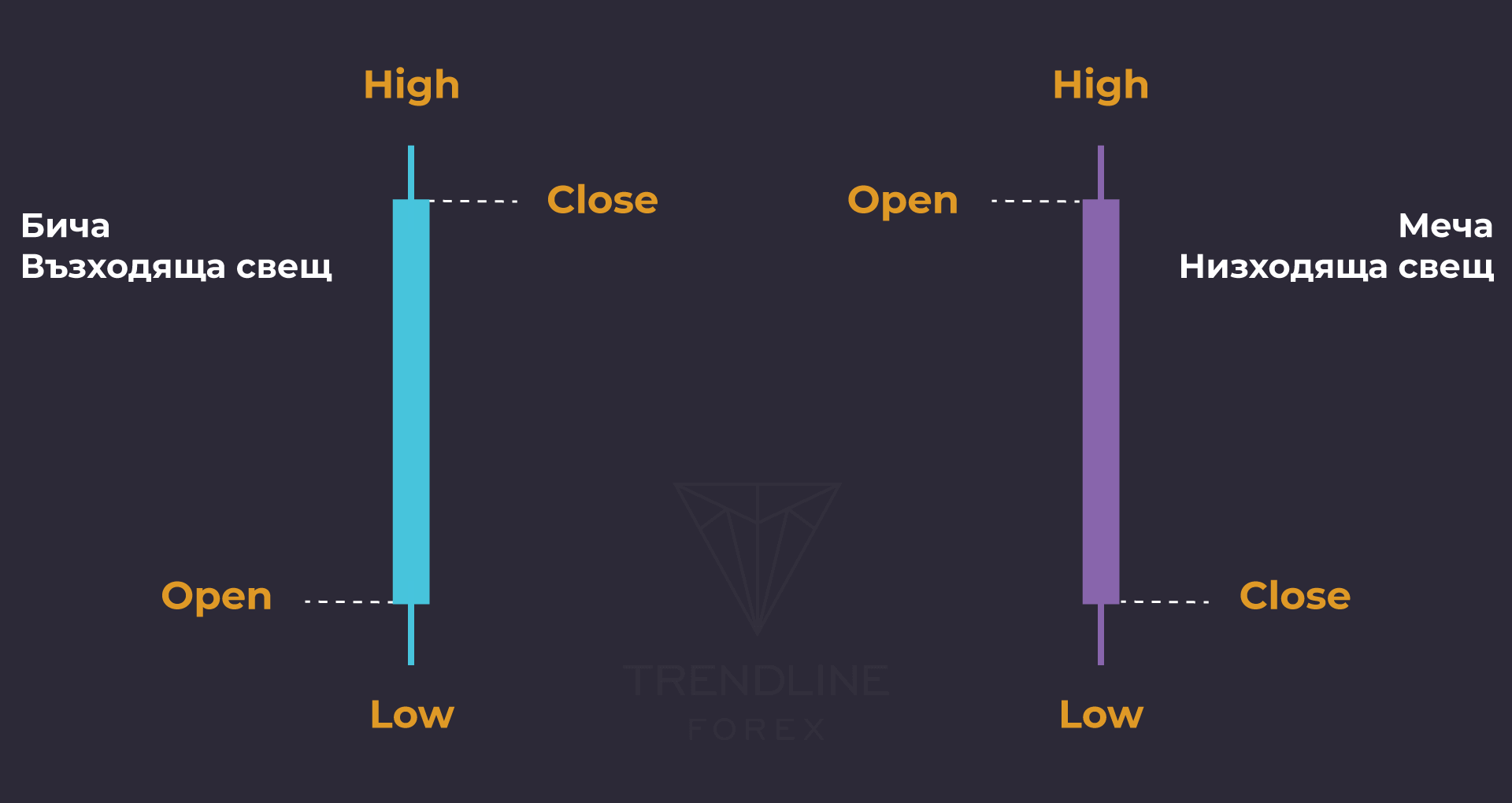
Вместо вертикална линия, както при баровете, свещите имат правоъгълник, който се нарича тяло. Тялото обозначава отварянето и затварянето на свещта. А най-висока и най-ниска стойност, се изобразяват чрез сенки или още познати като опашки.
Не е задължително всяка свещ да има опашки. Може например, цената на отваряне да съвпада с най-ниската цена при възходящата свещ, тогава няма да има долна опашка.
Ако цената на отваряне, съвпада с най-високата стойност при низходяща свещ, тогава няма да има горна опашка.
На изображението виждаш пример за възходяща и низходяща свещ.
Друга характерна особеност при свещите, е че много лесно се различават меча и бича свещ, заради цветовете и формата. Платформите за търговия позволяват да се променят цветовете на свещите, според предпочитанията на клиентите.
Прието е възходящата свещ, да е с по-светъл цвят от низходящата. Стандартно низходящите свещи са с черни тела или по-тъмни, а възходящите са с бели тела или по-светли.
Така изглежда свещна форекс графика в платформата MetaTrader.
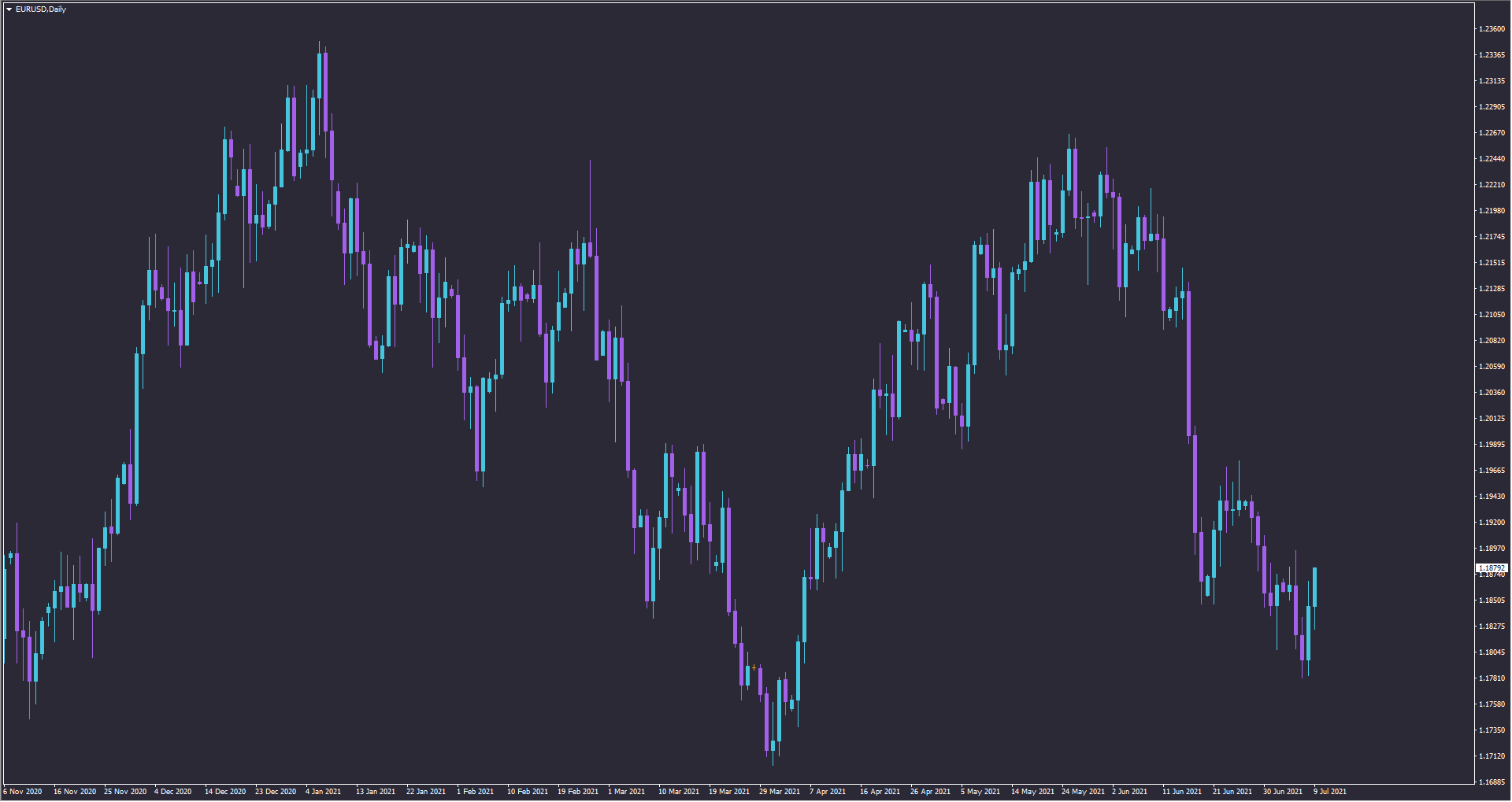
*Свещна, дневна графика на EURUSD | MetaTrader
Предимства на свещната форекс графика:
- Свещите се възприемат по-добре визуално;
- Анализа на графиката се осъществява по-лесно;
- Силно препоръчителна за начинаещи трейдъри;
- Фигурите и моделите на техническия анализ се откриват по-лесно.
Свещната форекс графика е най-разпространена сред трейдърите, заради по-доброто визуално представяне. Освен това, визията на свещта позволява да се прогнозира бъдещото движение на цената.
Как става това?
Трейдърите следят за големината на свещта, има ли опашки и колко дълги са те. Последователността от свещи също е важен фактор, когато става въпрос за прогнозиране на посоката на цената. Съществуват модели и формации от Японски свещи. Разликата е в това, че формациите се състоят от няколко единични модела свещи.
Това са някои от най-известните формации и модели на Японски свещи:
- Doji;
- Morning star;
- Hammer;
- Hanging man;
- Harami;
- Three white soldiers;
- Spinning top;
- Bullish engulfing.
Ако се затрудняваш с откриването им, имаме решение за теб!
В Trendline сме разработили експертна система, която открива над 30 различни формации и модели от свещи. Приложима е на всички пазари и времеви периоди, и лесно може да се интегрира към всяка стратегия.
Candlestick Patterns EA
Candlestick Patterns EA е еднакво приложим на всички пазари. Независимо дали търгуваш валути, злато, криптовалути или акции, робота ще открива формации и потенциални сделки вместо теб.
Графика Heikin-Ashi
Heikin-Ashi е форекс графика за визуално представяне на цената, която много прилича на Японските свещи.
Разликата е в начина на изчисление и изобразяване на свещите.
На Японски Heikin означава осреднена стойност / средно аритметично, а Ashi означава темпо / скорост. Следователно Heikin-Ashi може да се преведе, като “средна скорост на цената”.
Heikin-Ashi използва средни стойности за изчисление на свещите и по този начин представя по-чиста картина за посоката и силата на тренда.
Освен това във формулата влизат стойностите на отваряне и затваряне от предходния период. Също както при Японските свещи, низходяща свещ се изобразява с по-тъмен цвят, докато възходящата с по-светъл.
Формула за изчисление:
- Open = ½ (Open на предходен период + Close на предходен период);
- High = Maximum от High, Open or Close (което е по-високо);
- Low = Минимум от Low, Open or Close (което е по-ниско);
- Close = ¼ (Open + High + Low + Close).
Целта на Heikin-Ashi е да изчисти пазарния шум ,за да се вижда по-ясен тренд. Тъй като при изчисление взема средни стойности, свещите при Heikin-Ashi имат по-малки опашки в сравнение с Японските свещи.
- Светла свещ без долна сянка, сигнализира за силно възходящо движение;
- Тъмна свещ без горна сянка, сигнализира за силно низходящо движение.
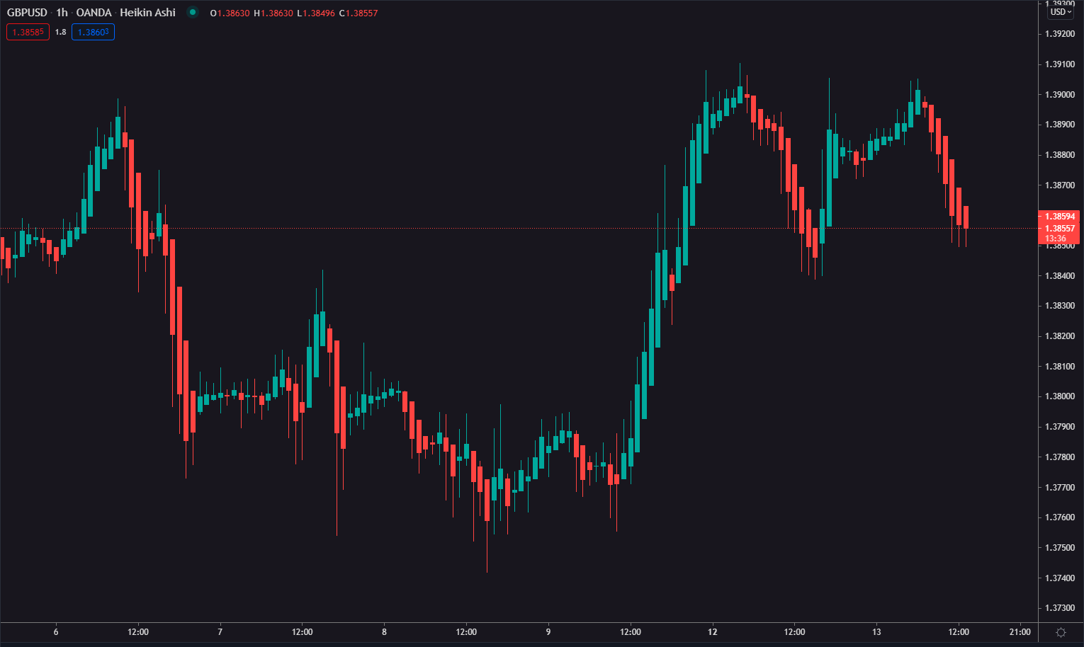
*Графика Heikin-Ashi, H1 на GBPUSD | TradingView
Както при Японските свещи и баровете, тук също има различни времеви периоди.
Renko графика
Renko форекс графиката се чертае само на база ценовото движение.
Вместо комбинация от цена и време, както е при повечето графики. Елементите на графиката наподобяват тухли. Нова тухла се изобразява всеки път, когато цената направи определено движение.
Всяка тухла е разположена под ъгъл 45° спрямо предходната, независимо дали е възходяща или низходяща.
С цветовете логиката е същата, възходяща свещ е в светъл цвят, низходяща свещ се изобразява с по-тъмен цвят.
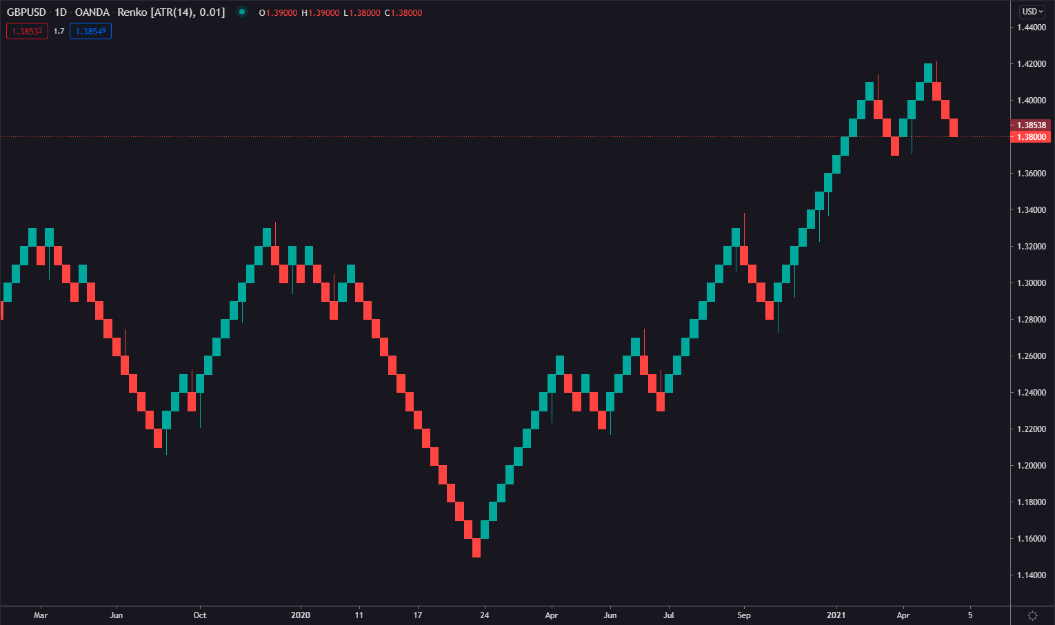
*Renko, дневна графика на GBPUSD | TradingView
Renko цели да филтрира малките колебания в цената, за да покаже по-ясно важните трендови движения. Всяка тухла представлява размера на движение на цената, например 20 пипса.
Ако цената направи движение от 20 пипса, независимо в коя посока, графиката ще начертае една тухла.
Renko графиката не е много информативна поради липсата на времева зависимост. Например продължителен рейндж може да се визуализира чрез една единствена тухла.
Обобщение
Както вече разбираш, има различни графики изобразяващи ценовото движение.
Важното е да избереш такава, която да разчиташ лесно!
Ние в Trendline използваме свещна графика, защото е достатъчно информативна и лесна за разбиране.
Добре е да държиш Форекс графиката чиста и да не добавяш много индикатори, които да пречат на решенията ти.


Предупреждение за риск: Всички продукти и услуги, предлагани от „Форекс Трендлайн“ ООД, са с изцяло образователна цел и не представляват инвестиционен съвет или препоръка за търговия. Търговията с финансови инструменти носи висок риск и може да доведе до загуби. Постигнати резултати в миналото не са гаранция за бъдещи успехи. Препоръчваме да се запознаете с пълните Общи условия преди използване на услугите ни. Нищо на този сайт не трябва да се тълкува като инвестиционен съвет от страна на „Форекс Трендлайн“ ООД или който и да е от неговите представители, директори или служители.
© 2026 Trendline. Всички права запазени